learn about all things surface pattern design including the creative design process, being a successful creative entrepreneur & stepping into the mindset of a successful designer
welcome to the pattern design blog
blog
The
Categories
Popular
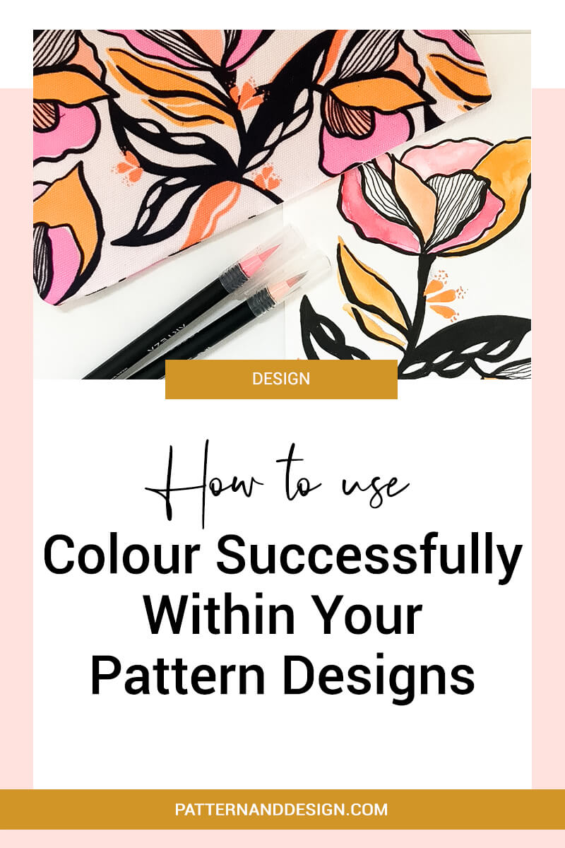
How To Use Colour Successfully Within Your Designs
One of the elements that are really important to get right when creating pattern designs is colour. It can make or break a design and be the reason someone buys or doesn’t buy your design. So, how do you use colour within your designs successfully?
If you struggle with using colour you want to make sure that you spend the time to develop these skills and think about how you can use colour successfully within your designs.
When you’re creating designs there are some general rules (which of course can be broken) and in this blog post, we’re going to look at some basic elements that you want to think about when you’re creating your colour palettes.
Tone
Firstly you want to include a range of colors that work together harmoniously, but you also want to have depth within your palette. The simplest way to do this is by having some lighter and darker colours. When I talk about lighter and darker colours, I’m talking about having some colours that are tonally lighter and tonally darker. If you choose colours that are all the same tone of value, then when you use them your design can end up looking really flat and not having a lot of depth to it. Using colours with different tonal values is a great way to achieve depth.
Colour combinations
When you create your palette, you may have created a palette that looks beautiful yet when you go to use the colours, some of the colours just don’t work well together within your design. You may find that some colours just don’t work when they’re placed next to each other. So you also need to think about how the colours within your palette work when being placed side by side. If some colours within your palette clash (in a bad way) then you need to be careful with how you use those within your design.
Base colours and highlight colours
You also want to think about how you’re going to use the colours within your palette e.g.some of the colours with be base or main colours and will be used in high quantities within your design and others will be highlight colours, which you’ll use sparingly as pops of colour. And if you were to use one of these highlight colours as a main colour you’d find that the colour wouldn’t work even though it works and looks beautiful as a highlight colour.
So you really want to think about how all of the colours within your palette work together and how they’re going to work next to each other within your designs. If you think about how are they going to work in different combinations before you start designing, it will help you use your colour palette successfully.
Want to create another revenue stream by turning your art into surface pattern designs?
Get the free guide
Get my FREE Surface Pattern Design Starter Guide


